Your Camera as a Value Finder
 Kathie Kerler
Use your phone camera to find the range of values in your fabrics.
I did a ten-year Master Series with Hollis Chatelain a few years ago. As an exercise on value, she had us select one of our quilts and take a photo in black and white on the mono setting of our phone camera. I chose this small 9" x 12" quilt. It contains hand-painted fabrics and papers. I thought the motifs and colors worked well together.
Here it is in black and white. Now it's easy to see that while "everything went together", nothing visually pops.
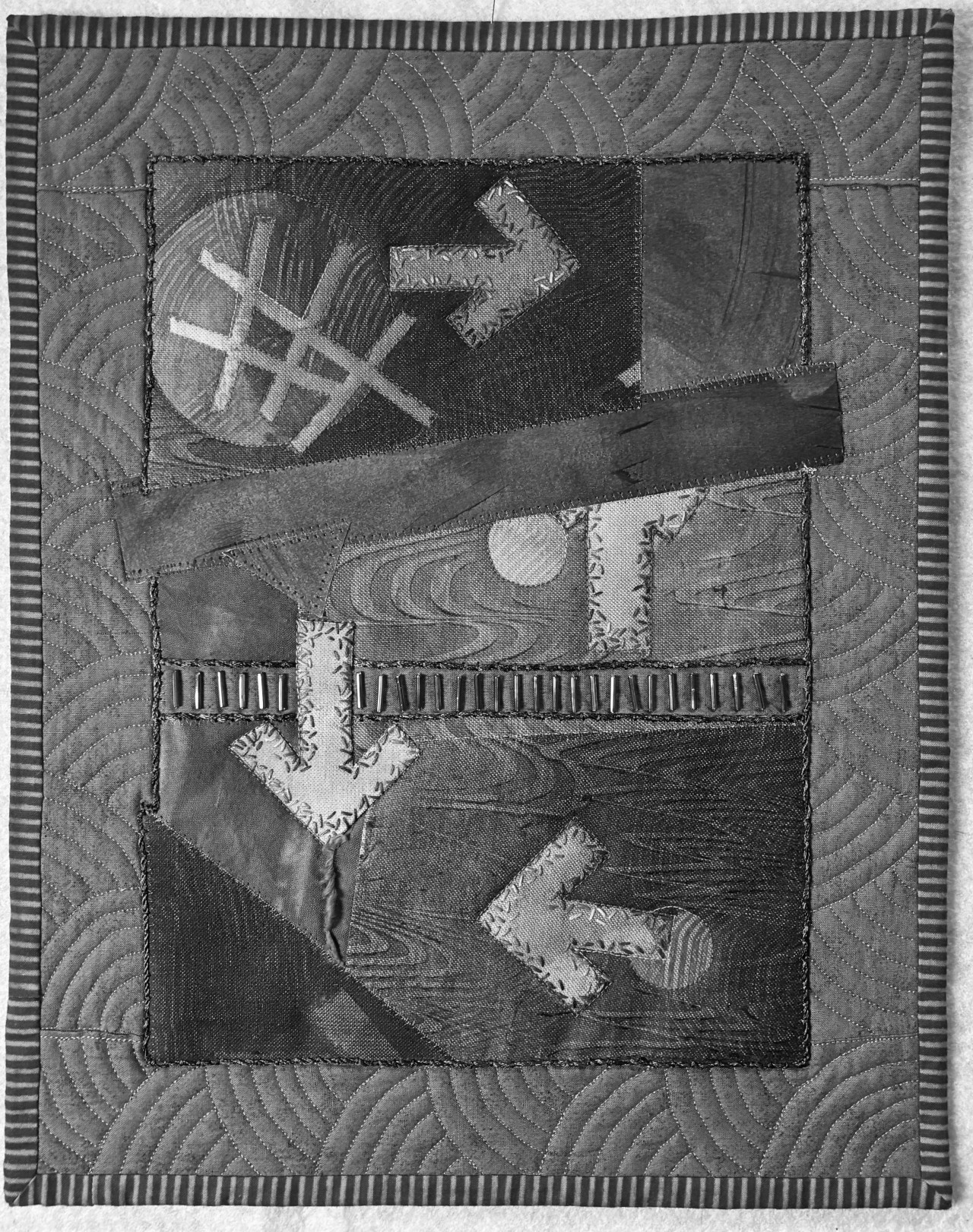
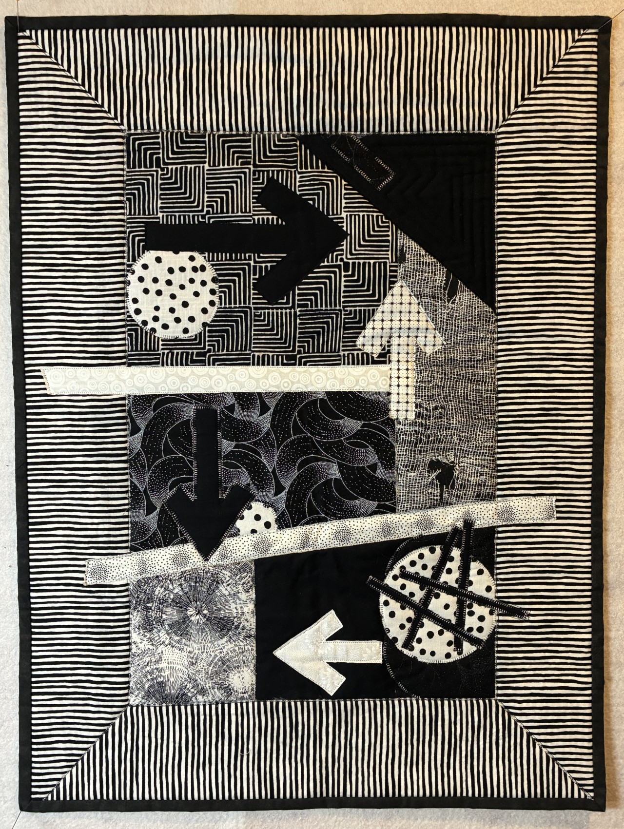
Next step was to recreate it in black and white, which is an achromatic color scheme. That means there is no gray. Here is the result. You can see the exact same composition is much more effective with strong value contrast. It even works with a variety of prints that you might think would be too busy together. Instead, they create visual texture.
These are the just some of the concepts we cover in my Quilt Judging Course, which is for all quilters, not just those who may want to judge. Anyone can apply this information to their own quilts. https://courses.kathiekerler.c...
Categories: : Elements of Design